FINTECH · MOBILE APP · 0-1
A Shariah-compliant group wealth management platform for families and trusted circles in the Gulf. I led all design from zero as the sole designer, defining the product architecture, building the design system, and delivering 200+ screens across Coordinator and Member roles, grounded in 12 user interviews and 100+ survey responses.
↑
Screens designed across the full product, from onboarding through investment settlement.
DESIGN
↑
Reusable components built into the Maqamy design system.
DESIGN SYSTEM
↑
Survey responses validating the problem space before the first screen was designed.
RESEARCH
↑
Users interviewed to ground every core design decision in real behavior.
RESEARCH
The team
three people. one product.
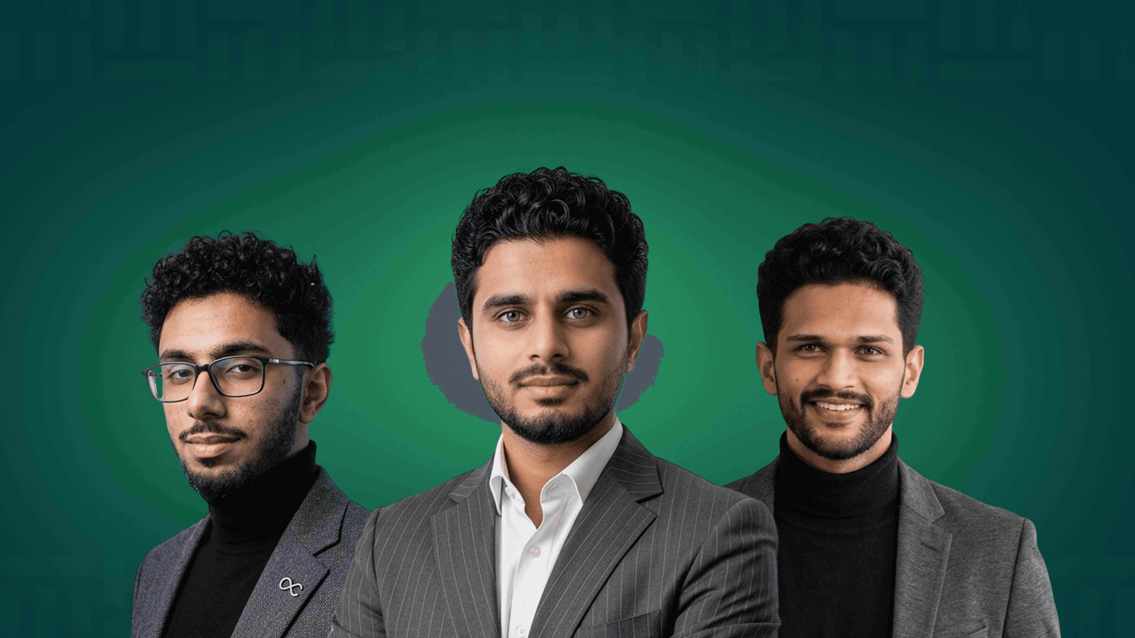
Maqamy was built by a founding team of three. Adil as founder setting product direction, Sidharth as technical co-founder owning the engineering, and me as the sole designer responsible for every user-facing decision, from research through final screens.
The design
whatsapp → platform.

01 · Context
group money, managed on trust and WhatsApp.
Gulf families and friend groups pool money informally for decades. No app, no record, no structure. Just a coordinator, a WhatsApp group, and an assumption that everyone will pay. The job: make shared wealth feel safe, transparent, and governed without killing the trust that made it work in the first place.
03 · Problem
trust breaks when money gets complex.
01
Contributions are tracked in messages and memory. When disputes happen, there is no source of truth.
02
Members have no visibility into their own contribution status or the group's overall progress.
03
One person manages reminders, records, disputes, and distribution with zero tooling support.
04
Groups want halal investment options but have no way to validate what they are pooling into.
“
the signal · USER RESEARCH + INTERVIEWS
FAMILY GROUPS
FRIEND CIRCLES
COMMUNITY POOLS
Trust, not returns, was the primary concern across every interview conducted.
04 · Research
the research confirmed what we suspected.
12 interviews. 100+ survey responses. One finding appeared across every group, whether they had invested together, stopped, or never started. People are not afraid of losing money. They are afraid of losing the relationship.
WHAT THE RESEARCH SURFACED
"I do not want money to affect my relationships."

Imran K.
ACCOUNTANT
"I stopped because there was no neutral structure. Everything depended on one person."

Sara M.
BUSINESS OWNER
"I want to contribute, but I have no visibility into where the money goes."

Layla S.
HOUSEWIFE
12 INTERVIEWS · 100+ SURVEY RESPONSES · JUNE 2026
05 · The BET
designed for trust, not returns.
The obvious move is to build a fintech dashboard: portfolio performance, ROI charts, asset breakdowns. But a family member joining a group pool does not open the app to check returns. They open it to answer one question: is my money safe and is everyone being treated fairly.
So the entire product was scoped around that single moment of confidence, not financial complexity.
What required a coordinator, a group chat, and a prayer is now a shared dashboard where every member sees the same information at the same time, without having to ask.
06 · Process
designed for two people with opposite needs.
The coordinator needs control. The member needs visibility. Building one screen for both would have served neither.
the bet
01
map the roles
Coordinator and Member have fundamentally different jobs. Mapped each role's core tasks, information needs, and anxiety points separately before designing a single screen.
02
define the flows
Six core flows: group creation, contribution cycle, investment selection, settlement, member management, and notifications. Each flow designed around the most anxious moment in that journey, not the happy path.
03
build the system
Designed 20+ reusable components before touching screen layouts. The system had to hold across 200+ screens without visual inconsistency.
04
prototype and iterate
Built an interactive Figma prototype covering the full coordinator and member journeys. Iterated based on informal feedback sessions before finalising screens.
07 · IMPACT
designed for two people with opposite needs.
Designed for the user
↑
faster task completion
Role-specific UI and simplified navigation cut the steps in key journeys like approvals and beneficiary management, so the work that mattered got done three times faster.
Designed for the user
↑
faster task completion
Role-specific UI and simplified navigation cut the steps in key journeys like approvals and beneficiary management, so the work that mattered got done three times faster.
Designed for the user
↑
faster task completion
Role-specific UI and simplified navigation cut the steps in key journeys like approvals and beneficiary management, so the work that mattered got done three times faster.
measured across approvals and beneficiary-management journeys
08 · REFLECTION
This wasn't just a redesign. It was a re-alignment of roles, priorities, and how we want business users to feel when they interact with BOX Mobile.
From structure to systems, every decision was rooted in real user insight and made flexible enough to scale. We simplified complexity without removing depth, and brought clarity to workflows that once felt overwhelming.
Working on this project wasn't linear, and that's what made it real. It involved sketching, unlearning, reworking, and lots of back-and-forth.
And as always, the process continues. Because great design isn't ever done, it just keeps getting sharper with every scroll, tap, and insight.
Next CASE STUDY · HEALTH TECH